Introduction to Effective Business Sign Design
Understanding Typography in Sign Design: Deep Dive
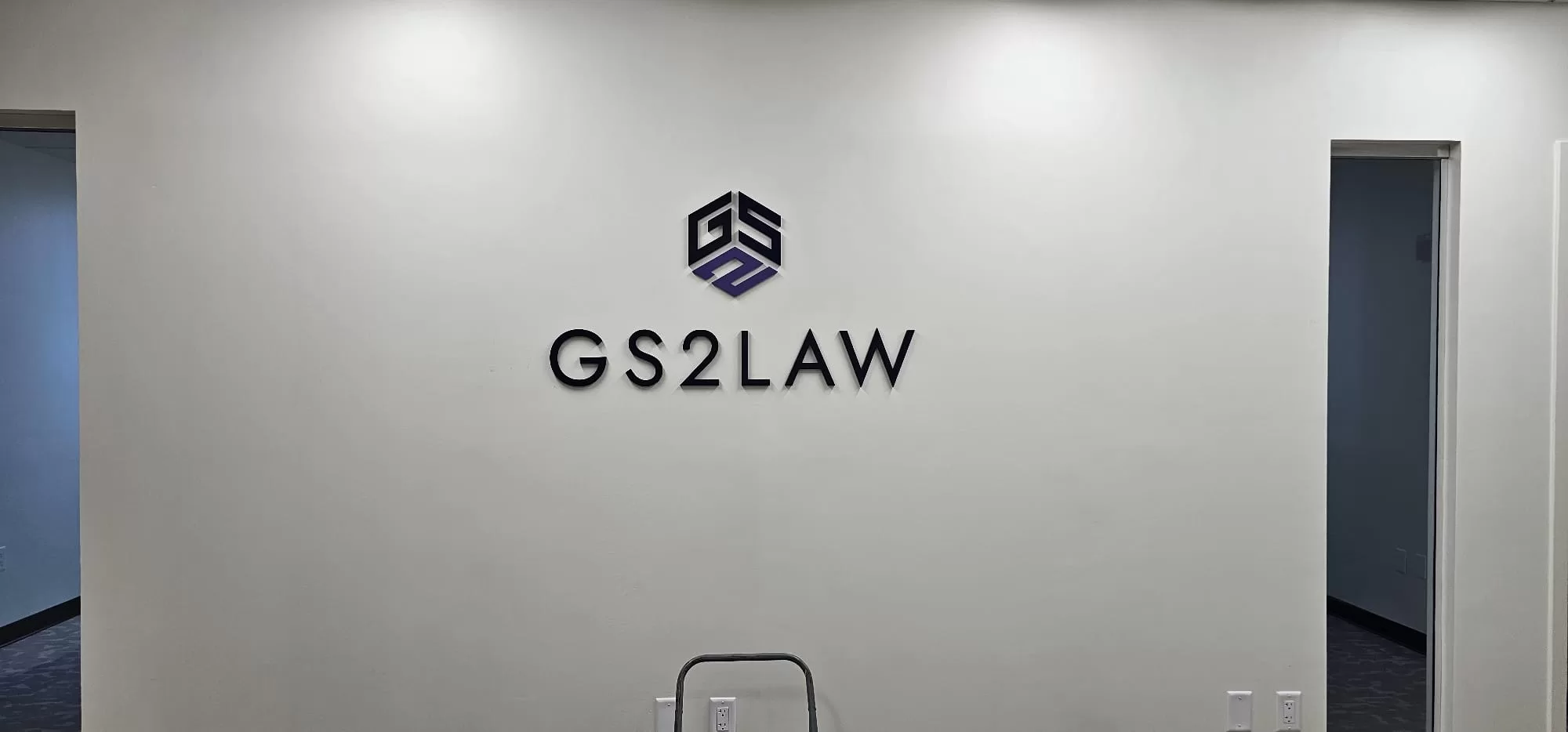
Typography plays an essential role in shaping a customer’s perception of your business. It comprises not only the style of type (font) but also the size, line length, line-spacing and letter-spacing, and the adjustment of space between pairs of letters. Studies prove that poor typography could reduce customer engagement by as much as 40% while more thoughtful typography could boost customer engagement by 30% (Source: Instant Signs).
Here are critical tips to follow:
- Keep it consistent: Matching the style and appearance of your typography with your brand image shapes customer experiences and increases brand recognition.
- Make it readable: High legibility is crucial. Avoid overly stylized fonts, and opt for a simple and clean design to ensure that your message is accessible to every viewer.
- Size matters: Your sign’s text must be large enough to read, especially from a distance. At the same time, avoid too-large fonts that can seem off-putting.
Color Psychology: A Deeper Understanding
The intelligent use of color can make your sign more impactful and compelling. The color scheme of a sign can stimulate various emotions in a viewer and can significantly sway a person’s feelings and behaviors. For example, cool colors like blue and green are typically associated with calming and soothing feelings, while warm colors like red and yellow are associated with excitement and energy.
A recent study conducted by Instant Signs , a leading sign company, reveals the following information about color perception and preferences:
| Color | Perception | Preference (Men) | Preference (Women) |
| Blue | Trust, reliability | 57% | 35% |
| Red | Excitement, passion | 14% | 9% |
| Green | Nature, freshness | 14% | 14% |
| Yellow | Cheer, warmth | 5% | 6% |
| Black | Luxury, sophistication | 6% | 10% |
Note: The percentages given indicate the proportion of respondents who selected that color as their favorite one.
Strategic Placement for Maximum Visibility: Best Practices
The careful positioning of your sign can radically impact its visibility and hence its effectiveness. Here are some tips for maximizing your sign’s visibility:
- Place signs at common eye-level to increase noticeability
- Ensure that the sign is in a location with high foot traffic such as entrances or near popular products
- Use lighting to increase visibility, especially during the evening or in low visibility conditions
Future Trends in Signage Design
As technology continues to evolve, we can expect it to bring significant changes to the signage industry. Some possible future trends include:
- Augmented Reality (AR): AR could enable businesses to enhance physical signs with digital content, creating a more immersive experience for customers.
- Artificial intelligence (AI): AI could greatly increase the customization of signs to cater to individual customer needs and preferences.
Keeping up with these future trends, along with the current best practices, will help businesses to continue capitalizing effectively on their signage, creating memorable and engaging experiences for their customers.
Frequently Asked Questions
How does color psychology impact sign effectiveness?
Color psychology plays a vital role in sign effectiveness by influencing human emotion and behavior. Different colors evoke different responses: red can trigger excitement or urgency, motivating quick decisions, while blue often conveys trust and security, making it ideal for corporate signage. Understanding the audience's cultural and psychological associations with specific colors can enhance message retention and actions motivated by signage. Using contrasting colors also ensures that important information stands out, improving the overall impact of signs.
What placement strategies maximize sign visibility?
Maximizing sign visibility involves strategic placement considering factors like sightlines, traffic flow, and obstructions. Signs should be placed at eye level or within natural sightlines to be easily noticed. Positioning signage near decision-making locations, such as entrances or points of sale, enhances its effectiveness. Leveraging technology like digital displays can adapt messaging based on time or event, further boosting visibility and relevance to target audiences. Understanding these dynamics ensures your signage is consistently impactful.
Why is message clarity important in signage?
Message clarity is crucial in signage because it determines how quickly and effectively information is communicated to the audience. A clear and concise message ensures that viewers, who often have a short attention span, can quickly grasp the intended communication. Using straightforward language, bullet points, and action-oriented verbs eliminates confusion and enhances comprehension, leading to better consumer engagement. This strategic approach minimizes cognitive load, maximizing the potential for achieving the desired response or action from the viewer.
What are sustainability trends in sign design?
Sustainability in sign design encompasses using eco-friendly materials and energy-efficient technologies. Modern trends include utilizing recycled or biodegradable materials, integrating LED lighting, and adopting digital displays that reduce physical waste. These practices align with the growing consumer preference for environmentally conscious businesses. Moreover, sustainable signage can lower operational costs and align with corporate responsibility goals. Staying informed about sustainability trends through resources like Instant Signs ensures that a business aligns its signage strategy with broader environmental and social initiatives.